“In his 1964 essay ‘Rhetoric of the Image’, Roland Barthes gave us two terms that help define different ways of using words with pictures:” `Anchor & Relay’. Simply put, the text assigned as ‘Anchor’ is a rigid format that clears any ambiguity of intent from the image, fortifying or reinforcing the meaning of an image. It is frequently used in advertising where the sponsor needs all viewers to be under no illusion as to what and who is being promoted. The ‘Relay’ text is designed to work in conjunction with the image and is assumed to have equal status. This balance between the two encourages the viewer to think for themselves what the message is. This is very much in keeping with the Postmodern ethos, and should prove to promote a strong sense of achievement from the viewer, having had to think and interact to draw conclusions.
The description of these two tags is just a small part of what adds up to a very comprehensive break down and analysis of something that we very much take for granted. To put this into perspective, Barthes gives us a very short list of examples of the ways that linguistic code can enhance an image: “as title, caption, accompanying press article, film dialogue & comic strip balloon (speech bubble)”. The list is far greater than this, and worthy of our time.
References:
Barthes, Roland (1964). Image, Music, Text. Ed. and trans. Stephen Heath. New York: Hill and Wang, 1977. 32-51.
Exercise
Why does Labour have such a problem with patriotism?. Relay
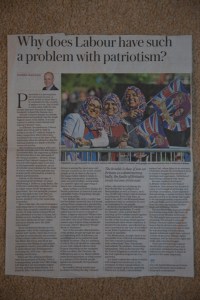
Photo by: Bruce Adams/Daily Mail
Why does the Conservative party have such a problem with patriotism? Relay
Patriotism transcends race, creed & colour! Anchor
Royal affairs followed from afar! Relay
Royal wedding even followed in Kuwait. Anchor
Crowds gather early on the streets of Algiers…….. to watch the royal wedding on the big screen! Anchor
A country united for a day! Relay
Pomp & circumstance unite us for a day. Anchor
The day religion didn’t matter. Relay
A royal wedding every weekend should sort us! Relay
This image is from ‘The Daily Telegraph’ which is known for it’s right wing views. Interestingly, the picture, although an image of patriotism could be used in either a left or right wing newspaper with the same effect, as I have shown with my first caption.
Both the original and my first caption are good examples of ‘relay’ headlines. The image is all about the support of all things British, iconised by the union flag, which is augmented by the word ‘Patriotism’ in the accompanying title. This sits in curious juxtaposition with the three foreign looking ladies clearly supporting Britain, which through historic knowledge of British politics creates an uneasy dichotomy with the word ‘Labour’! The headline(s) are designed to draw you in and absorb the complexities of the image, beyond what you first see, which incidentally, will be viewed in different ways depending on what part of the country you come from!
My second heading is very much an anchor line. It tries only to tell you what is seen at face value.
My third is a little more ambiguous and asks such questions as; What country is that photo taken in?, Why are these foreign people being patriotic to GB?, How many others are there/are they expecting if they have to put railings up?
By including the country of origin in the headline, this next one is taking much of the ambiguity out of the image. In one very short sentence we are given three facts, the country of origin, the reason for the flags (wedding) and the significance of the event (it is a royal event). Much of this can also said for the next headline.
‘A country united for a day!’. This asks quite a few questions, prominently What is dividing the country normally , and Is a royal wedding really enough to cease hostilities for a day?
The next is also a similar headline, but the words/phrase ‘Pomp & circumstance’ are guaranteed to always prick the interest of the innocent browser or fervent royalist. In doing so they create an anchor that enhances and encapsulates what the image is about.
The next headline offers up questions rather than facts about the image. Religion and politics will always evoke passion and interest, so leading with a strap line that religion doesn’t matter will always generate an interest in spite of the image.
My final heading is a little vague and possibly ambiguous and so I would classify it as a relying title, inviting questions as to the meaning of the image and how it ties in with the title.
Balding customers risk brush with disaster in the world’s new hair transplant capital Relay
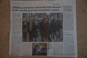
Photo by: Sam Tarling for the Telegraph
Istanbul; Transplant capital of the world. Anchor
Cheap, but is it cheerful? Relay
Cheap clinics sprouting everywhere. Relay
Turkish delight. Relay
Turkey no longer on the fringes when it comes to hair transplants. Anchor
Cheap hair transplants, but what are the risks? Anchor
Is the west charging too much for hair transplants? Relay
Value for money, or Russian roulette? Relay
The actual title is very long, and eludes to a number of possible stories within the one. As such I think the title needs to be vague yet have strength to invite the reader in. This is cleverly done with the use of a little bit of word play, a tool which is very powerful and creates a whole new draw of it’s own. picking up on the humour presented by the author will often invite the reader to read on, just to be entertained or for the enjoyment of the authors style.
My first title is a firm anchor title, stating a fact (maybe a bit of poetic license) in very few words, punchy!
My second, is very short too, but makes a statement and asks a question, always a good hook to catch the casual viewers eye. Though simple and direct, the fact that a question is involved really does make it a relay. It is an open question which by it’s nature does not have a definitive answer. Open questions are generally associated with relays.
My next heading incorporates a play on words, much the same as the original title does, thus inviting intrigue in its vagueness and the humour.
‘Turkish Delight’. A play on words, but not necessarily humorous, catchy nevertheless. It offers a juxtaposition between what is seen in the photo and what the title is associated with (i.e confectionary). So unrelated that this must be a (tenuous) relay.
A quite long title. Long titles by there existence are able to offer a lot of specific information if written well, and therefore are able to be both anchors & relays, depending on how mischievous the author wants to be. On this occasion I have chosen to offer up an anchor with a little bitt of humour thrown in for good measure.
Next is the first of three question titles, but I don’t think they are all necessarily structured the same. The first offers us a fact, but then follows it up with a statement within a question. The statement being that there are risks. It doesn’t at this point tell us whether the risks are proportionate to the costs, which could be interpreted as a relay perhaps, but I think that the overall weight within the title offers more of an anchor to the image, setting out the premise of the article that follows.
This may as well be a question about religion, it is asking us to choose between East and West. As westerns we often view all actions by the East (…ern governments) with suspicion, as I’m is the same from the other side of the fence. As such this title could lead the reader of in any number of directions, with a plethora of veiled or otherwise topics to get our heart rate up! This must be a relay title.
Finally a very vague title which could so easily be about anything but what the image is showing us. The title offers us another country (always viewed with suspicion by the West), money and vagueness in it, what more do we need to draw us into an article? Again, another relay for sure.
‘It’s not the frequency of attacks, but the severity…’ Relay
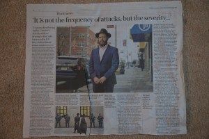
Photo by: Mark Lennihan/AP
Out of the frying pan into the fire! Relay
Anti-Semitism stalks us wherever we go! Anchor
Does the rapid rise in anti-Semitism in USA stem from Washington? Anchor
Are the streets safe for American Jews? Relay
The changing face of Jewish fashion. Anchor
What it means to be Jewish in New York. Relay
Alone in New York! Relay
Increasing police presence on the streets of New York. Relay
Working undercover as a jewish police law enforcer. Anchor
This is a very non descriptive photograph and open to many interpretations. In fact it so so non descriptive that I found it difficult to come up with any ideas! It does have a much smaller supporting photograph which is much more dynamic! This begs the question; Why wasn’t this used as the leading image? This article is very cleverly worked insofar as the very mundane lead image is supported by a more dynamic, yet smaller image, also there is a Strong title and a stronger still subtitle. Add to this a strong relay quote and interest cannot fail to be aroused! It is presented as a complete package which the reader should enjoy ‘unwrapping’.
I have based all of my working titles on the main image alone.
My first is most definitely a ‘relay’ title and is written in much the same vein as the original title. It is a re-write of the subtitle in the original text, but is vaguer, preferring to use a well known idiom to maintain some mystery. The use of idioms as working titles is a very good way of keeping things vague and a strong use of relays.
Anchoring a bland, nondescript image is quite difficult, but as the man is clearly dressed in a very Jewish style, using any words with a strong jewish link can provide a strong and secure anchor. So this is what I did. Semitism and anti-semitism are very much at the forefront of the news at the moment, and so by including one of these words, I created an immediate and strong link to the image.
‘Does the rapid rise in anti-Semitism in USA stem from Washington?’ This is a matter that is touched on in the text, but is not given as much space as I feel it warrants. I think this title is much stronger than the one used. The use of the word Washington is more than eluding to President Trump, and again, President Trump is a very hot topic at the moment. The title I have used here is a direct irrefutable question, which once read, cannot be left without an opinion/answer.
The next title is again a question. This time I feel that the question can be applied to many different environments and situations. No one set image comes to mind, allowing the mind to explore many different scenarios. This title can be directly referenced to the article it its taken from or it can be used in a much broader way, inviting people to think about historic persecution (within the U.S.) rather than the recent escalation in violence.
This next title is a desperate attempt to move away from its original intention. As the image is so vague about its message, it really only requires a little bit of lateral thinking.
This next title is much the same as the previous one, insofar as the limitations are governed by the limits of ones imagination.
Alone in New York! Ditto!
This next one I feel must be a relay, because the title itself can be read either as a statement or a question. So with this ambiguity from the start we are already asking questions, regardless of the content of the image! My title came about by trying to see something else within the frame. The only part that is sharp is the person, beyond this, all else is blurred to a point of near obscurity, except the police car! So this was what I focussed on to come up with a title.
With my creative juices now flowing, it was just a step further to come up with something quite fanciful such as this! It could certainly lead to a very interesting article.
Maimed policeman seeks rougher ride for dangerous drivers. Anchor

Photo by: Tom Pilston
Determined to walk the beat just like any other policeman. Anchor
It’s about setting goals! Relay
I had to move on for my own sanity! Relay
Marathon man! Relay
I have to live with my own stupidity! Anchor
Every day this reminds me to take my tablets (Diabetes) Anchor
I ignored it for so long, then it was too late (gangrene) Anchor
This article has much the same structure to it as the previous one. The leading image is a little more capturing, but the less/supporting image is much more dramatic. I think the lead image is selected here because of the human/emotional element. Where this one differs, is that the headline is much stronger and is a statement of intent.
This title clearly sets out the statement of intent that the man in the picture is saying. It is clear and unequivocal. It gives us information that cannot be gleaned from the picture alone. This is the link between the image and the text.
It’s about setting goals! Again, it is another statement of intent, but this time it is more vague and tells us nothing. Until we look at the supporting images, there is nothing to whet our appetite. I have deliberately been vague with the title as this clearly has a story to it (an amputee that is determined to get on with his life). By using a vague title I have kept the reader guessing as to where this story is leading until they read the supporting text.
This title is one for the ‘journeyman’ and as such is definitely a relay title.
Marathon man! I think this title has a foot in both camps! I’ve classed it as ‘Relay’ because ultimately it doesn’t say anything specific, but as a working title, I think it is fairly easy to see where the story is going. That said, it could be a tenuous link to something else, so I feel that I am right to have gone with my choice.
Here I have turned the original title on it’s head. My idea would be to tell the story in his words of how he did something very stupid (In hindsight) which backfired and resulted in the partial amputation of his left leg. I think the nature of the story warrants a ‘no holds barred’, to the point headline, a proper anchor!
My second to last title is again trying to give a completely different story to the original, by turning it on its head and making him his own victim. I don’t know too much about the effects of Diabetes, but I know that limb loss is a distinct possibility if you don’t ‘self manage’ properly. This is another example of a strong and emotive story that really should only have an anchoring title to augment the seriousness of the subject.
Finally, this is the same as the one above but just with a different type of ‘attack’.
Fraudster taunts victims of £2.4m scam while living it up on the run Anchor
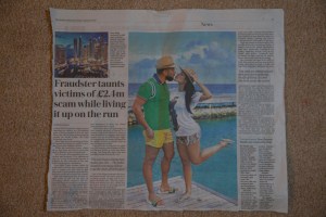
Photo taken from: Sunday Telegraph Sunday 5 January 2020
Dubai on a shoestring Anchor
Finding love in Dubai Anchor
Compensation means I can now live the high life. Anchor
Girls girls girls Relay
Life on the run is not easy! Relay
I can’t come back to the UK for fear of wrongful arrest. Anchor
My sister and I are so in love! Anchor
“Splashing the cash on good clobber pulls the birds every time!” Relay
This last image is quite strong and can send out strong messages, but is again easily open to interpretation/misinterpretation! Interestingly it has a supporting image with it which strengthens what the main image is showing, rather than what the article is about! The title is certainly unambiguous, unlike both of the images. So whereas the title flies in the face of the main image, the supporting image is very much an anchor which leads to, on the face of it, misinterpretation of the story! A very interesting presentation!
Looking at the titles I have chosen, really shows how this image was completely the wrong one to print. It gives the victims little hop, if any, of justice being done. Each of my fictitious titles create a story about the man in the picture either benefiting from good fortune, or him being the victim!
My first title suggests that you read on to find out how you can put yourself in place of this man for a reasonable sum. It is a clear statement with no ambiguities and sets the tone for what is to follow.
The second title suggests clearly that the man in the picture has found his perfect match in Dubai, and that this is clearly the place to go if you are looking for love and a very attractive woman to boot! This is clearly a sales technique (for the gullible!), but requires a strong anchoring title to give it credence!
Once again I have turned the story on its head and shown how easy it is to misinterpret an image. Once again with a bold and direct statement I am trying to railroad through the truth and create something to mislead readers with the use of conviction in a title.
This next storyline could be about almost anything but involves the good life and the rewards of living the good life. The Title has to be a relay as the girls are really just the tip of the iceberg and are in a way a photographic idiom.
Life on the run is not easy! I have chosen this title to really exemplify what a relay can do by setting the title and the image in juxtaposition with one another. The opposition could not be more pronounced, yet the title still draws you in.
This next title is not dissimilar to the previous one and leaves you in no doubt as to what the story is about, even though the image is misleading.
My sister and I are so in love! Let’s move on, this just shows that you can read almost anything into a photo, and be convinced/hoodwinked with or without text.
This next image works really well as a relay as it really draws you to something that is so obvious that it can sometimes be overlooked. As an image, the thing that should really stand out the most is the really bright colours of the clothes that the man is wearing. The image shows us a man and a woman, we see that they are kissing and that they are in a holiday environment. It isn’t until we read the title that we then go back to the picture and look at what the man is wearing. On closer inspection we may be able to see the quality of the clothes and the logos, but only because of the visual to’ing and fro’ing initiated by the relay effect of the title!
All images were taken from The Sunday Telegraph published Sunday 5th January 2020.
Sophie Calle’s Take Care of Yourself
I received an email telling me it was over.
I didn’t know how to respond.
It was almost as if it hadn’t been meant for me.
It ended with the words, “Take care of yourself.”
And so I did.
I asked 107 women (including two made from wood and one with feathers),
chosen for their profession or skills, to interpret this letter.
To analyze it, comment on it, dance it, sing it.
Dissect it. Exhaust it. Understand it for me.
Answer for me.
It was a way of taking the time to break up.
A way of taking care of myself.
Sophie,
I have been meaning to write and reply to your last email for a while. At the same time,
I thought it would be better to talk to you and tell you what I have to say outloud.
Still, at least it will be written.
As you have noticed, I have not been quite right recently. As if I no longer recognized myself in my own existence. A terrible feeling of anxiety, which I cannot really fight, other than keeping on going to try and overtake it, as I have always done. When we met, you laid down one condition: not to become the “fourth”. I stood by that promise: it has been months now since I have seen the “others,”because i obviously could find no way of seeing them without making you one of them.
I thought that would be enough, I thought that loving you and your love would be enough so that this anxiety – which constantly drives me to look further afield and which meens that I will never feel quiet and at rest or probably even just happy or “generous”- would be calmed when I was with you, with the certainty that the love you have for me was the best for me, the best I have ever had , you know that. I thought that my writing would be a remedy, that my “disquiet” would dissolve into it so that i could find you. But no. Infact it even became worse, I cannot even tell you the sort of state I feel I am in. so I started calling the “others” again this week.
And i know what that means to me and the cycle that it will drag me into.
I have never lied to you and I do not intend to start lying now.
There was another rule that you laid down at the beginning of our affair: the day we
stopped being lovers you would no longer be able to envisage seeing me. You know this
constraint can only ever strike me as disastrous, and unjust (when you still see B. and K. …)
and understandable (obviously…); so I can never become your friend.
But now you can gauge how significant my decision is from the fact that I am prepared to bend to your will, even though there are so many things – not seeing you or talking to you or catching the way you look at people and things, and your gentleness towards me – that I will miss terribly.
Whatever happens, remember that I will always love you in the same way, my own way, that I have ever since I first met you; that it will carry on within me and, I am sure, will never die.
But it would be the worst kind of masquerade to prolong a situation now when you know as well as I do; it has become irreparable by the standards of the very love I have for you and
you have for me a love which is now forcing me to be so frank with you, as final proof of what
happened between us and will always be unique.
I would have liked things to have turned out differently.
Take care of yourself.
Sophie Calle’s Take Care of Yourself is a body of work (letters, writings, videos) created for the French Pavilion of the 2007 Venice Biennale – curated by Daniel Buren.
Sophie Calle’s book entitled ‘Take care of yourself’ was published by Actes Sud Press on June 1st, 2007 (4 dvd and two leaflefts are inserted).
Calle received a letter from a boyfriend, and she wasn’t exactly sure what he was trying to say (He was ending their relationship!). She passed the letter to a girl friend to see how she interpreted it. From this act, the idea developed that she would give the letter to a selection of professional women to read, with a view to seeing how each of them interpreted it. The women that she selected used the skill of interpreting in their own jobs; Actresses, singers, psychologists, sociologist, philosopher & writers. In all, 107 women were asked to ‘present’ their interpretation of the email, each was recorded and played back simultaneously throughout her touring exhibition of 2007, ‘Take Care of Yourself’.
I think the letter itself appears to be honest and open. I think the two issues at hand are, the medium of its delivery and, ‘that final line!!’
The fact that it is written is the reason d’être for this entire body of work. Had it been a conversation, then anything artistic that would have come from it would have been here say and therefore biased, just like a photograph! Also if it had happened as a conversation, she would have had every opportunity to clear up any ambiguities or unanswered questions. This, I think would subsequently lessen the feelings of hurt & rejection that Calle clearly must have felt. Had this been a letter written from a woman to a man, and then presented as an artistic body of work in the same way, would it have had the same impact? The content of the letter suggests that she was the one that made the rules and framework within which the relationship would function, therefore suggesting a hint of sour grapes! She asks 107 women to “To analyse it, comment on it, dance it, sing it. Dissect it. Exhaust it. Understand it for me. Answer for me.” She knew what the letter meant, in reality, she was offended by its content, more precisely the way the content was presented!
As a concept, possibly based on the notion of humiliating her spurner and exacting some form of revenge or ‘levelling the score’, Calle has really made this public in every possible way. We call this body of work ‘postmodern’, but is it really? Is it not just an elaborate way of getting back at her ex? Is it just a clever way of having the last laugh, denying him a further reply, without revealing himself. I question whether it is in fact her that has been thoughtless, cold and cowardly (if only in response, provoked or otherwise!).
I think for this to have gained real kudos, it should have been put out to a mixture of both male and female ‘collaborators’, instead of just to a diverse group of ‘sisters’ that would feed back what she wanted to hear. In doing this, it would allow the viewers to at least go on the many journeys (Videos et al) with a chance of the end results varying, and thus giving the whole exhibition more than a single dimension.
I suggest that this body of work is more about a clever collective of multimedia put together to put across a very transparent and direct point, rather than in the true vein of postmodernism, allowing the viewer to integrate and form their own opinion. The 107+ journeys that we are asked to go on are not only linear, but just a series of parallel journeys which all lead us to the same ending.
Ultimately, the gallery goers are the audience, not the initial viewers i.e ‘The 107′, who basically became co-authors of Calle’s idea. The gallery goers have nothing to figure out, they are not left to their own devices. They are all readers of the same story and are all herded, time and again to the same increasingly stale and predictable ending. This is as far from Barthes’ ‘The Death of the Author’ as can be gotten! It is in effect a very old story wrapped in very pretty postmodern wrapping.
Sophy Rickett’s Objects in the field
Many bodies of work presented by an artist, which use another artists work as either a datum point or as a framework to which their own work is either intertwined or piggybacked, do not involve the artists collaborating or even having discourse. However, in the case of Sophy Rickett, her body of work ‘Objects in the field’ was made under the mindful, and I suspect critical eye of the original ‘maker’ of the work presented.
Given the amount of time she spent with Dr Roderick Willstropp (RW), Sophy Rickett (SR) is not able to call her work a collaboration (possibly as she had hoped to)! Ordinarily, with such opposing views, a project is doomed to fail. Although the scientist was unable to see the other view of his work as artistic, and the artist struggled to understand the concepts and constructs of the scientists work, SR was able to produce a body of work which, when presented in a gallery (Kettle’s Yard, Sept 13th – Nov 3rd 2013), proved to be an artistic success.
Very early on into her project she realised that it wasn’t going to be the collaboration that she had hoped, but was clever enough to take a small step back and watch as it morphed and she became the sole force of her project. The challenge then became one of how best to ‘engage’ this unwilling participant, and use him in such a way as to give her body of work gravitas, by getting him on side and thereafter adding his weight to the project by providing the captions to each image.
I think it is the nature of the beast that the artist will always be more open to collaboration than the scientist, and so for me the story seems all too predictable. That said, this very battle between fact and fiction (the images have been ‘altered’ by the artist and are therefore not a true representation of anything) is what creates the interest, what draws you in and seduces you into looking beyond what is presented to you. It interests me that both the words and the images are quite sterile, yet there is still friction between the two, and it is this that creates the real and yet subliminal ‘relay’, a subtle and beguiling lure!
Postmodernism
To be ‘post’ anything, there has to be a ‘before’, therefore, to understand what postmodernism (in photography) is really about, we have to look at its roots, what went before.
An overview of photography shows us that there has really only been three eras, Traditional, Modern & Postmodern. Anything that is new, whether it be skateboarding, stargazing or photography, has to start with the basics, because it has no pre-knowledge, no foundations, it has to create its own foundations from nothing. So with photography, the traditional era was just that, it was about discovering the rules, working out why ‘the rule of thirds’ worked. The first era was purely about recording, recording facts and documenting. As with all things though, the nature of the human mind is to explore, push the boundaries and see how far you can go with a process or explore where a certain line of thought will take you. Eventually, all thing lead to art and entertainment, even science, and so photography was no exception. Although the Traditional era wasn’t necessarily short lived, it wasn’t long before artists were using the medium to their own ends. By the time Laszlo Moholy-Nagy was experimenting with photograms in 1922, the modern era of photography was well under way. In fact it had officially been going some twelve years by then. Alfred Stieglitz, Paul Strand, Tina Modotti and Edward Weston can be counted amongst its earliest pioneers.
As a word, postmodern is in itself a misnomer, given that ‘modern’ is the latest ‘thing’, it is therefore not possible to have something more modern than is. Futuristic maybe, but this suggests something that is merely an idea, but this in itself is heading in the right direction. ‘Postmodern’ should be thought of more as a label that encompasses an infinite variety of concepts and ideas. It sets out to question, challenge and push the boundaries of what is/was currently accepted. This runs in parallel with the findings and supposition of what goes on in all fields of science. In fact this thought pattern is really what drives us forward in our thirst for knowledge and sets us apart from the rest of the animal kingdom!
Kicking off proper in the 1950’s when artists began to come together from across the world throwing off the long worn shackles of the post war era of depression and suppression, postmodernism really took a hold of all forms of art. With Postmodernism transcending all forms of art, the work of Andy Warhol can be held up high for all to see. Much of his work combined the use of the camera with other mediums. Although Warhol can be held up as the ‘poster boy’ of postmodernism, it is (amongst others) the work of Robert Rauschenberg which offers up some of the fundamental principles of postmodernism. Much of his work gets away from ‘ownership’ and ‘creator’. Take Automobile Tire Print (1953); Although Rauschenberg orchestrated his own idea, the artist must surely be the person that drove the car, as it was he that effectively wielded the brush?!
The world we live in today is only just beginning to breakdown and overcome the barriers of race, creed and sex which have held us back for so long, yet these are part of the ethos of postmodernism in art/photography! British postmodernism started to come to the fore in the mid to late eighties, spearheaded by a group of students who became know collectively as ‘Young British Artists’ (YBA). Their style and content relied/revolved around shocking the viewer so much so that what they actually achieved was notoriety. Artist such as Tracey Emin, who rose to fame through her work, ‘My Bed’ (1998) and Damien Hirst with works such as ‘The Shark’ (1991) (Or to give it it’s official title ‘The Physical Impossibility of Death in The Mind of Someone Living’), these artists and many others at the forefront of Postmodern art all went on to be regarded in the years that followed as the most successful of their generation, although it would seem that controversy followed them around. This would be largely due to the perception or lack of the general public of what Postmodernism is all about. What the ‘uninformed’ were seeing was ‘nonart’ being produced with materials and tools not normally associated with the arts.
As stand alone pieces, the work that these artists were producing were Postmodern in themselves, but the artists drew in and provoked the journalistic press, and they unwittingly became a part of each individual piece, adding a dimension not seen before, that of notoriety. A technique straight from the text book of the Postmodern ethos.
Continuing with Postmodernism, American photographer Duane Michals adds a dimension to his images by writing, often in his own handwriting on his images. Adding anything to an image can surely only enhance it. One very poignant image of his This Photograph is My Proof, illustrates this beautifully.

Studying the picture without any writing gives us a general sense of warmth and happiness. In spite of the bareness that surrounds them, suggesting a possible lack of financial wealth, the closeness which exists between them (her physical closeness to him, and his demeanour and bearing suggesting total trust & acceptance of her love) gives off only positivity. It is easy to imagine them both fifty years later, looking at this image and it still bringing them warmth and a sense of togetherness.
By adding the text, we are left in little doubt that this is a relationship that broke down and eventually ended. The writing gives the image a place in time, or more accurately, a place within a sequence of events. Furthermore, we make the assumption that the writing is Michals’, and therefore that it is him in the image, thus giving it a very personal feel and I think subtly altering our thoughts and feelings regarding the image. We are now personally involved, mores than if it had been of somebody that we have no knowledge of whatsoever. The writing releases little clues, which when put together leave us feeling sad (and maybe reflecting within our own pasts!). The title, though fairly neutral, offers straightaway an inkling that all is not as it seems. The use of the word Proof is very confrontational, it is a very magisterial word. Then we get a better idea, when he talks of the past ‘…were still good…’ This is when our hearts begin to sink and the lacquer begins to fall away. The last two sentences add the ache to complete that which the picture, standing alone, can never do. ‘She did love me. Look, see for yourself’. It is as though he is (still) trying to convince himself, trying to recall tender moments that are lost from memory, and only affirmed by this photographic record.
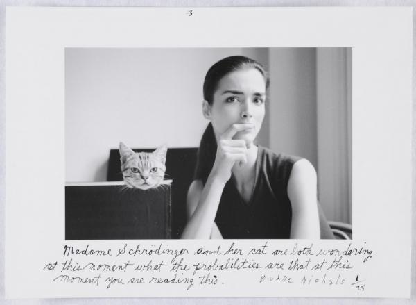
Duane Michals; Madame Schrödinger’s Cat, 1998; From the series Quantum.
This (3 of a series of 3) has all of the undertones of a Dali painting. When you know Schroedinger’s theory (Quantum physics) this becomes a very clever combination of image and words which just teases the mind for a couple of moments. As with the image above, his use of words alters the viewing experience completely. Without words this is really nothing more than a portrait, but by adding his words to the image, it has now become an interaction between the viewer and the subject matter, with her musing the question directly at the viewer, and you the viewer, in turn, engaging with the subject (and her cat).
Exercise
Learning log. Notes on interpreting poem.
The Charge of the Light Brigade
I
Half a league, half a league,
Half a league onward,
All in the valley of Death
Rode the six hundred.
“Forward, the Light Brigade!
Charge for the guns!” he said.
Into the valley of Death
Rode the six hundred.
II
“Forward, the Light Brigade!”
Was there a man dismayed?
Not though the soldier knew
Someone had blundered.
Theirs not to make reply,
Theirs not to reason why,
Theirs but to do and die.
Into the valley of Death
Rode the six hundred.
III
Cannon to right of them,
Cannon to left of them,
Cannon in front of them
Volleyed and thundered;
Stormed at with shot and shell,
Boldly they rode and well,
Into the jaws of Death,
Into the mouth of hell
Rode the six hundred.
IV
Flashed all their sabres bare,
Flashed as they turned in air
Sabring the gunners there,
Charging an army, while
All the world wondered.
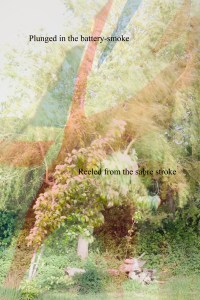
Plunged in the battery-smoke
Right through the line they broke;
Cossack and Russian
Reeled from the sabre stroke
Shattered and sundered.
Then they rode back, but not
Not the six hundred.
V
Cannon to right of them,
Cannon to left of them,
Cannon behind them
Volleyed and thundered;
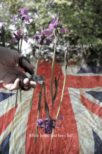
Stormed at with shot and shell,
While horse and hero fell.
They that had fought so well
Came through the jaws of Death,
Back from the mouth of hell,
All that was left of them,
Left of six hundred.
VI
When can their glory fade?
O the wild charge they made!
All the world wondered.
Honour the charge they made!
Honour the Light Brigade,
Noble six hundred!

The aim of this exercise was to select a poem that resonates with me, then interpret it through photographs. The idea is not to describe the poem, rather to convey the feeling of it. My shortlist of poems were; The charge of the Light Brigade by Alfred, Lord Tennyson, The Tyger by William Blake and two lays from The Silmarillion by JRR Tolkien, one being The fall of Fingolfin, and the other being The battle of Sauron and Felagund. I think the VE Day celebrations must have been weighing heavy! I had read the history of TcotLB many years ago, and the sense of anger I felt at not only the loss of so many men, but the fear and dread they must have felt whilst the war of egos and arrogance raged behind them stayed with me.
The more I read TcotLB, more more I could feel the changing rhythms and intensity, and the subtle allusions to the social gap (not to mention the monumental errors made by the Officers) between the officers and the cavalry.
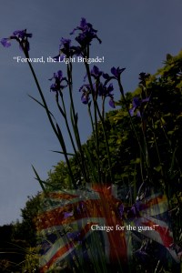
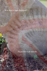
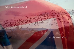
My notes and ideas for photographs included things like steam train wheels turning, dust, cattle packed tight, the trace of lights from a disco ball, a person stood against an imposing building, fruit being crushed, Union Jacks & trampled flowers. I realised I had two or three shots that would work, just using flowers. However if I wanted to use other types of images, there would be an imbalance. Three of these images strongly connected with specific verses, so I then realised that the challenge was to then continue with the flower theme and to then interpret the other three verses using flowers too. This was actually real quite easy, and by now I had also had thoughts about having an overlay of the Union Jack running through the series. Each of these overlays are different in their opacity and how rampant they are. This is deliberate and what binds everything together and gives a different feeling to each image.
In image one the Generals stand tall and proud above the flag, for them it is not about patriotism. Whilst through the flag I have allowed the cavalry to show through, wrapped in the colours. The Generals are almost in silhouette, proud, aloof and unreadable.
Image two is about the moments before the charge. It is about defiance, loyalty and patriotism is ever present, but not at the forefront of their minds. The marks left by the fossilised ammonite in the stone are very similar to the marks you see on an O.S map of a bluff or ramparts, such as the route they were charging into.
The flag in image three is fully unfurled and the colours are strong, representing the feeling of the men and the passion rising, their blood is up! The strength they must have felt as they all charged together is represented in this unfurled and proud banner.
Image four represents the clash as the charging cavalry drive headlong into the static cannons and Cossacks. The burred trees are indicative of not only the gun and cannon smoke, but of the confusion and disorientation that must have engulfed everybody. This image is full of the sounds, smell and raw emotion of brutal combat. The semi rampant flag has a nice flow and rhythm that fits perfectly into the image. Again, this image does not seek to portray patriotism, but every man would have said they were fighting for God and King!
Image five is symbolic of the soldier literally cut down, whilst the generals look on dispassionately from on high. This time the Union Jack is a duvet cover, and although was initially meant to represent the soldier falling from his steed to imminent death, safe in the knowledge that he was being wrapped and comforted in honour, it has, by a quirk of fortune, the look of a flag that is draped over a coffin!
Finally, image six was shot into the sun, to get lens flare. This gives the strong feeling of reflection, and adds a wistful feeling to the image. The flag is of course at half mast to honour the fallen.
Each image has two lines from its relevant verse on. These were chosen to signify what each verse was about, the two strongest lines in each verse. These lines are added, not as dummy proof signs for the viewer as to what each is about, but because I do feel that they give strong cohesion, bonding both the images to the poem, and making them one.
