Reportage photography is generally accepted as being less rigid when it comes to the truth, and more open and susceptible to interpretation, both by the viewer and the photographer. It is by its very nature a style based on and immersed in emotion. Whether it be for the sake of art, or as ‘on the ground’ documentary, the photographer is always immersed in and therefore subject to an emotional pull which draws one to photograph a scene in a certain way.
Henri Cartier-Bresson had the amazing ability to create both documentary style reportage, and the more thoughtful and contemplative artistic images. The image below has for a long time fascinated me, prompting many questions. A sign of a well worked photograph is surely one that asks something of the viewer.
 Cartier-Bresson. Henri, Dessau, (1945). Magnum Photos.
This images taken by Cartier-Bresson, shows what we are told is the discovery/interrogation of a female Gestapo informer at Dessau in 1945. As the scene unfolds, it is interesting to see the subtle changes in posture and facial expression of the onlookers. In this image the crowd are compact, close and threatening, as we assume the charges are coming to light. In the following 3-4 images, her beating/punishment is meted out and the expressions start to relax and enjoy the balancing out of justice, and the crowd are less compacted and less threatening, as the victim is humilliated and disempowered.
This image encapsulates Cartier-Bresson’s idea of ‘The decisive moment’ and leaves the mind hungrily waiting for the next few seconds, such is the tension and emotion that is captured in this split second.
To the casual viewer of this image though, without foreknowledge of it could just so easily be viewed in complete reversal! The ‘victim’s’ resigned expression and posture can just as easily be explained as that of an innocent captive having been caught trying to escape by an incensed crowd with bloodlust. Such can be the ambiguities of reportage photography. These events were played out in a very short space of time and the from start to finish was very linear (we are lead to believe by the series of shots), so could HCB have shot this sequence in such a way as to convey or imply a different set of circumstances or evoke different feelings?
Even being in possession of the details of the situation, and having knowledge of what the Gestapo did to people, people who were caught as a result of the passing on of knowledge by such as the woman in the picture, I still can’t help but empathise with the feeling of terror that the woman must have been feeling, knowing that she was about to suffer at the hands of a mob ready to impart their own form of justice. At the same time I was also feeling some sort of elation having viewed the following images, to have seen ‘justice done’. Is this the power of Cartier-Bresson’s imagery or is it human nature? Maybe it should be known as ‘The Divisive Moment‘!
We know for a fact that what is contained within an image cannot accurately convey what is happening outside of the image. It cannot even reliably imply what is beyond. It is down to each of us to ‘fill in the missing’, but it is imperative that we accept that this is only a single version of a possible truth. The key word that must always be used after having assessed and judged an image is the word ‘version’.
This image really does typify ‘outsider photography’. So many people are in the frame, yet non appear to be aware of HCB as he records what is going on. No matter how captivating the spectacle, you would expect at least one person to be looking at the camera. As an outsider, people are aware, curious and suspicious of you. It is extremely difficult to become invisible, but this is what is needed.
‘Insider photography’ comes with its own set of problems. Often the area in which you are working can be small and revisited many times, and so it is essential that the photographer is always aware of what is going on and ready to catch the unexpected, whilst always looking for unique angles to maintain interest. Another very important issue is that of being able to gain the trust of the individual(s) being photographed. Without this trust you can never get a truly good image of people being themselves. It takes a long time to gain this trust, and is not easily won. There are a number of truly great ‘insider’ photographers; Nan Goldin, James Ravilious and Mona Kuhn are just three of many. It was James Ravilious that first sparked my interest in the ‘insider’ technique when I went to an exhibition in Exeter on 20th July 2013 called ‘Reflecting the Rural’. He chose an entire village (and some) to befriend in Devon. It was a body of work that was seventeen years in the making and produced somewhere in the region of 80,000 photo’s, working for the Beaford Archive.
The farming community can be notoriously insular and an unwelcoming place for an outsider (not in the photographic sense). Having spent seventeen years in and amongst, he was able to get some very candid shots that few other people would have been able to.
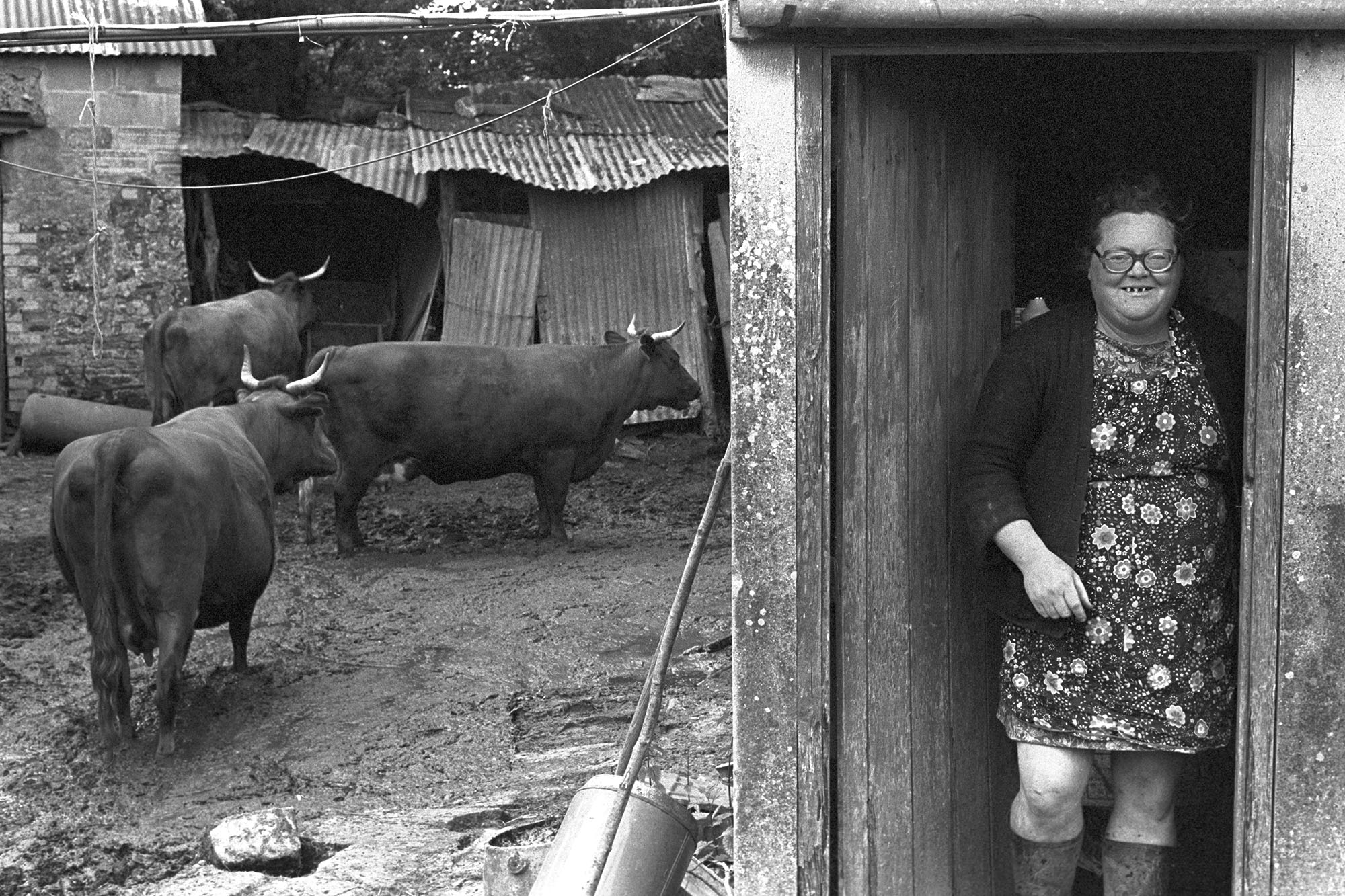 Olive Bennett with her Red Devon cows, Cupper’s Piece by James Ravilious © Beaford Arts
<img class="mainThumb" style="color: #000000; font-family: -webkit-standard; font-style: normal; font-variant-caps: normal; font-weight: normal; letter-spacing: normal; orphans: auto; text-align: start; text-indent: 0; text-transform: none; white-space: normal; widows: auto; word-spacing: 0; -webkit-text-size-adjust: auto; text-decoration: none;" src="https://beafordarchive.org/wp-content/uploads/RAV-01-0384-10.jpg" alt="Two shepherds sheltering from the snow in shed door.
[Archie Parkhouse and Ivor Brock sheltering from the snow in a shed doorway, in a field in Millhams in Dolton. Ivor Brock has a paper sack over his head and Archie Parkhouse is smoking a pipe.]” width=”1040″ height=”693″> Archie Parkhouse and Ivor Brock sheltering from the snow. April 1975 by James Ravilious © Beaford Arts
Two fine examples that show the subjects relaxed and comfortable looking directly at the camera. Having lived and worked myself in the farming community, I know many Archie Parkhouse and Ivor Brocks’, and it takes a long time to be accepted into their lives, but this is the reward!
Colour and the street
The format of colour photography (as we know it today) properly took off in the mid 30’s when Eastman Kodak produced the first integral film (film on a roll in a cassette or cartridge) which he called Kodachrome. Over the next forty years the the science of colour developing had moved at such a rate that by the eighties, black & white photography had all but died out as a means of photography for the common man.
Street photography and its use of colour has its origins in, amongst others but primarily, the hands of Walker Evans. It was Evans that produced books such as ‘American Photograph’. It was not his first publication, but possibly his most important, as it provided a springboard for another photographer, Robert Frank. Frank was an avid admirer of Evans and always went to great pains to to tell people that the inspiration for his monumentally significant book ‘The Americans’ came from Evans’ work. Frank took the work of Evans and developed it further. Where Evans’ work was observational, Frank made it lighter and more satirical. It is easy to see how these two books alone started the development towards street photography. Over the following fifty years or so many photographers have taken the work of Evans & Frank and each has put their own spin on it, slowly adding colour to the mix, leading us to where we are now. That transition period was full of ‘boundary pushers’ such as; Garry Winogrand, Joel Meyerowitz, Fred Herzog, Diane Arbus, Vivian Maier & Helen Levitt to name but a few. Each bringing something different to the table; Winogrands spontaneous ‘in your face’ photography; Meyerowitz exploring colour street photography as early as the sixties; Herzog’s mixed bag of black & white and latterly colour (slides); Arbus staking out the streets & allies less trodden; Maier with her calmer style of black & white’s and later her clever understanding of colour; Helen Levitt, making full use of her earlier connections to the greats (Evans, Cartier-Bresson et al) to produce beautifully sensitive street images of New York, equally comfortable shooting B&W or colour. Levitt being the the spark that lights the touch paper that sends Martin Parr’s equally anthropologic work into the stratosphere, exploding with all the colour of a Guy Fawkes Night display!
One of the early champion of colour photography was, Stephen Shore. Shore along with the likes of William Eggleston used their craft to bring colour photography to the masses as an art form. This will have taken place in the late seventies and into the eighties. Prior to this the use of colour was solely the domain of the commercial artist and advertiser.
At the age of fourteen he, almost precociously took his work to show the great Edward Steichen, who, seeing the boy’s potential bought some of his work. From this moment on he was destined to achieve greatness in the world of photography. Shores style is very easy to spot and is very consistent in its content and style. Some of his images leave you wondering ‘what made him even decide to lift his camera to that?’ This has lead me to the question; If he is trying to show banality, why not shoot in B&W? Surely that would emphasise the point. On reflection I think that the colour allows you to wander through the images and see the depth of the banality. The B&W images are so banal as to be wallpaper, and the eye dismisses the image too quickly.
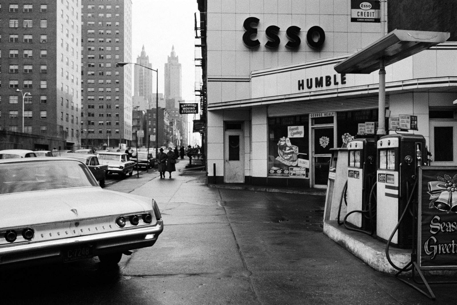 Esso Black and White, New York, by Stephen Shore. New York, New York. 1964.
There is definitely a lot to take in here, but it is much more difficult for the eye to rest upon.
 Washington Street, Struthers, Ohio, by Stephen Shore October 27, 1977.
There isn’t a single part of this composition that is remotely interesting, but by shooting in colour, it divides the image up and entices the eye to move from one part of the image to the next, and rather perversely study the interesting minutiae of the banal parts!
There is an interesting comparison to make between Henry Cartier-Bresson’s work and that of Stephen Shore’s, and that is that both photographers choose a location deliberately. Where HCB would choose the location as a spot where there is potential for something to happen which will then make a good image, Shore chooses his location for the exactly the opposite reason. Shore is looking for place where nothing has happened for years, and is unlikely to happen for coming years, yet each produce an image of worth.
It would be remiss of me to talk about street photography without mentioning the recently departed Robert Frank, one of the forefathers of street photography. Following in the footsteps and greatly influenced by ‘the original’ Walker Evans, Frank broke new ground in a time when America was safely snuggled and buffeted with its ideology of “patriotism, optimism and scrubbed suburban living“.
Frank’s street photography was all B&W, and it could be argued that in some way it was no different to that of Shore. The fundamental difference though was that by and large, Franks work was about the everyday people of America (Frank’s road trip across American in the mid 50’s was funded by a fellowship from the John Simon Guggenheim Memorial Foundation) culminating in “The Americans”, a book which at the time was reviled by reviews, “But when the book came out in the U.S., in 1959 (it was first published in France the year before, since no American house would touch it), the critics did what critics do when confronted with something beyond the standard: they lacerated it and ruined sales. The first edition sold only 600 copies. Popular Photography called the work a “meaningless blur, grain, muddy exposures, drunken horizons and general sloppiness,” and went on to say that Frank was “a joyless man who hates the country of his adoption.” (https://www.vanityfair.com/culture/2008/04/frank200804). Time has proven it to the contrary, and it has stood the test of time, proving to be a seminal book in photographic history, showing us all that despite the veneer, America was no different than most other nations.
Learning log. Research Point on Martin Parr.
Exercise
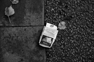
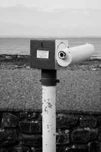
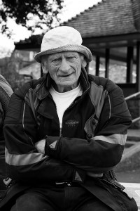
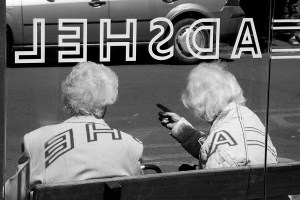
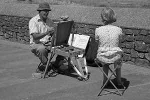
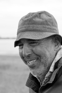
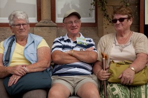
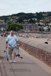
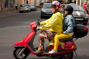
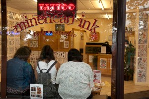
The follow images were all shot in the ‘tired’ victorian seaside town of Minehead, on the Somerset north coast. Although there are only two close up portraits, I am still pleased with the outcome, and don’t feel as though I’ve ‘dodged the bullet’. As an ensemble I think that the images work hand in glove with the B&W format to give exactly the right feel. There are a few weak image which, if they stand alone, have little to say (the architectural lion, and the couple holding hands). I also think that maybe one or two could be strengthened with the use of colour (the hats, and possibly the poster). The last portrait was just too good to leave out, having worked so hard to strike up a ‘relationship’ with the man.


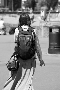
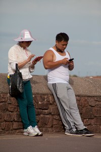
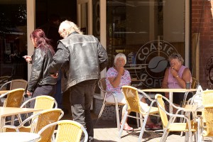
The following images were all taken in the same location as the ones above, only in colour. I think that by using colour, it broadened the horizon of things I could look for i.e bold colours, humour and things in general that would be lost in B&W, for instance the buckets and spades.Again there are some weak shots; The bikes, which lack something, the lovers, I needed to be much closer to convey the intimacy. Over all though I think I have achieved a collection of images that are (dare I say) in the style of Martin Parr, which is what I’d had in mind from the beginning, once I’d chosen to do a seaside town. I feel as though I have brought a fair bit of humour into the exercise; The runners/marshalls collecting the signs, the Rockers and older ladies and the man in the wheelchair. After having taken the colour shots, I felt a lot more worn out, having had to have eyes in the back of my head to spot everything. The B&W shots were a lot more sedentary in the making.


Learning log. My observations on the differences between my colour & B&W shots.
