Three critical viewpoints
Martha Rosler – Charity
As I have mentioned before; Rosler believed that contrary to their objective, photographers such as Hines & Riis, operating at the turn of the 20th century, were producing work which was appealing to the better nature of the rich to ease their own conscience by donating to charity, rather than trying to empower the poor, encouraging them to pull themselves out of poverty. By using the softly softly approach, they were reinforcing the social and financial difference between the two classes, allowing the rich to feel good about themselves by giving some of their wealth to a good cause. In doing so the poor would always be indebted to the rich, and reminded should they start to get above their station!
Susan Sontag – Compassion fatigue
Sontag believed that, regarding specifically war photography, the public have been numbed to the effect of dramatic and graphic photographs simply because of the volume they have been bombarded with. She believed “viewers became reduced to inaction, either through guilt or a dismissive lethargy towards making a difference”. She later reversed this view in Regarding the pain of others (2004). It is still a viewpoint held and used by many today.
Abigail Solomon-Godeau – Inside/Out
Solomon-Godeau believes that there are other ways that photographers can view their objectives. Using the word binary, she believes that a common view is that the images are either taken voyeuristically and objectively, or confessionally and subjectively (Surely a voyeuristic photographer can only produce subjective images!?). She offers an alternative; Images that provide a less emotive but more ‘truthful’ view. Two examples she puts forward are Robert Frank’s The Americans and the work of Ed Ruscha. Furthermore she suggests that Martha Rosler’s depiction of the Bowery (New York slums) was more about representation that than presenting fact. In doing so she was pushing photography as art to the fore.
All three viewpoints can be found in more depth: Chapters 3,5 & 6 La Grange, A. (2008) Basic Critical Theory for Photographers. Elsevier Ltd.: Focal Press.
It is worth bearing in mind the time period that the photographers that Rosler is talking about were operating, in relation to the age of photography. It was still relatively young and quality imagery was only just coming of age. It is easy to view and pass judgement with hindsight. Technology has to develop at its own pace. If technology was such that high ISO film was available and cameras were compact then who is to say that the styles and techniques would have still been the same. Every invention, whether it be the television or the vacuum cleaner, develops at a speed equal to our demand and expanding knowledge. Knowledge is the key which enables further knowledge to be gained. Likewise, Rosler’s views on the apparent objectives of the likes of Hines, are only thoughts that have had the chance to be developed over time, the same as any invention.
This linear portrayal of development will eventually run into Susan Sontag’s thoughts about ‘Compassion fatigue’. With age (the existence of the camera) comes history and repetition (of war). These experiences allow those whose industry it is, to put together a ticklist of types of images that grab the attention of the viewer, and ultimately, sell newspapers. What Sontag’s views highlight is our lack of vision, or forward thinking as an industry. We’ve done ‘shock’, and it has worked. The time has long since passed for us to have re-evaluated and worked out what is beyond ‘shock’. I think we have been guilty of merely looking for different ways to shock, instead of looking for different angles or viewpoints which can still generate strong emotions that can drive us to do more positive things. Are there any other images out there that are more ‘contemplative’ but which have the power to inspire people to action, or at least rouse them from their ‘dismissive lethargy’?
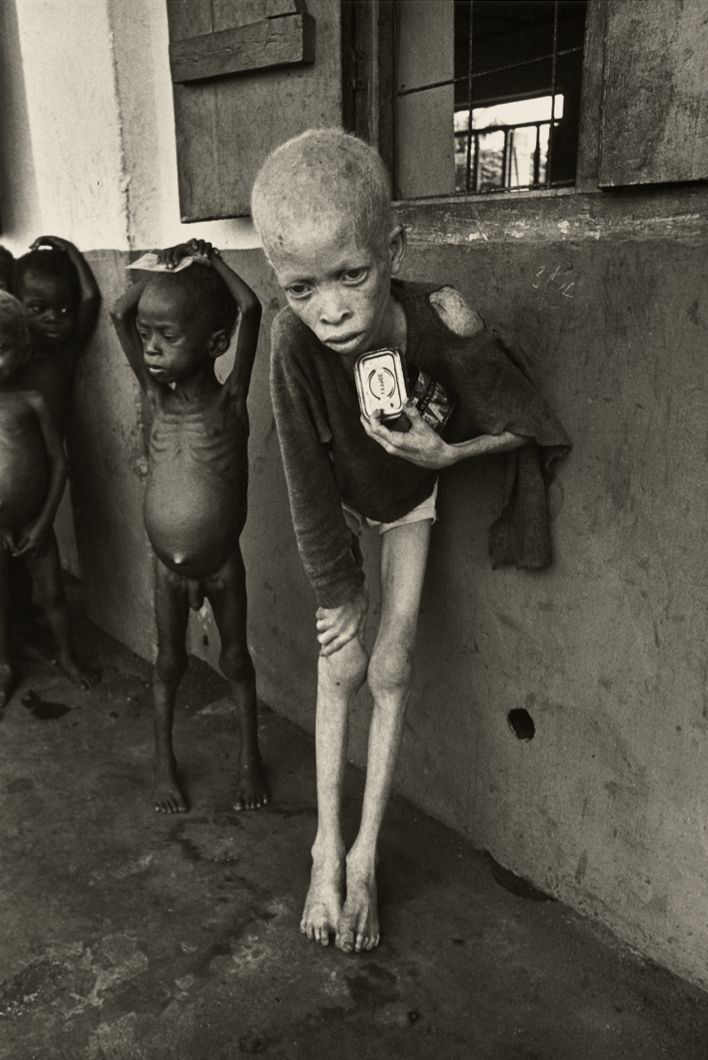
McCullin, Don, (1968). Biafra,
There can be few more powerful images of war than this! Don McCullin was well known for looking beyond the obvious, taking more of an interest in the victims of war rather than the protagonists. The Sunday Times Magazine sent him on this assignment to Biafra to cover the scale of the people that were being starved to death by the actions of the Nigerian and British governments (a bitter irony!). These days I think there is tighter censorship on what can be viewed in newspapers, but this is more than compensated for when you go onto the internet. McCullin’s thought provoking images show us the horror of war from a different angle. By showing us not only the suffering from emaciation, but also the utter loneliness of the ostracised albino child, McCullin is cleverly widening the demographic that he is aiming at. Given the absence of gore, anybody can view this image without turning away to be sick, allowing us to view and take in the more subtle horror. Any human being that has raised and cared for an infant can not deny the pain they must feel when viewing this image. Once seen, it cannot be unseen or forgotten.
Photojournalism. Learning log.
Aftermath and aesthetics
To put everything into perspective, there is a genre, or sub genre of war photography which is called ‘Contemplative or aftermath’ photography. It is not a new phenomenon, indeed an early champion of this style was Roger Fenton. His recordings of wars in this format go back to The Crimean conflict of 1853-1856. The irony of his work is that because of the lack of materials and knowledge at that time, Fenton’s photographs could only be captured using very long exposure times. In spite of this, he refused to create images which contained dead bodies. Thus he unknowingly create ‘aftermath’ photography.
Arguably his most famous photo is the the one he called ‘Valley of the shadow of death’. It is actually two photographs! As you can see below, the positioning of the camera is identical, but what is different is that the cannonballs have been moved. Logically you would think that he has come upon the (famous) scene of ‘The charge of the Light Brigade’ and taken the first image of the balls strewn randomly where they have landed, then having moved all of the balls to one side, taken the second shot. In fact, Fenton has taken the ‘cleared’ shot first (the scene as he found it), then because he felt (and rightly so) that the cannonballs strewn randomly ‘where they had come to rest’ would be more aesthetically pleasing, has rearranged them so. Furthermore, the scene in question is not the actual sight of the charge of the light Brigade at all, this was some distance to the Southeast.
 Fenton. Roger, ‘Valley of the Shadow of Death’. 1855. Courtesy of The J. Paul Getty Museum.
 Fenton. Roger, ‘Valley of the Shadow of Death’. 1855.
In David Campany’s essay ‘Safety in Numbness’, he questions the ability of ‘late photography’ to fully convey the complexity of political events, citing Joel Meyerowitz’ body of work on the aftermath of the twin towers attack of 9/11. The work is a beautiful study of what remained. There were no bodies or personal effects, instead concentrating on the strange abstract beauty of the twisted metal emerging from the chaos of rubble, and poisoning fumes and dust of what were once two mighty towers. By avoiding sensation and shock, things to feed morbid curiosity, Meyerowitz’ work allows us instead to study the images for longer, allowing us to read each image fully, and to see the detail that isn’t hidden by the heavy shadows of death. These images show life, endeavour and human emotion, and at the risk of being too poetic, the very first glimmers of the phoenix rising from the ashes. I think that Campany overlooks this. Television footage shows the horrors of what happened that day, something of this magnitude will never be forgotten, and for those that want to feed on the horror, there will always be somewhere on the internet for them to slake their thirst. It could be levelled at Meyerowitz that he is trying to depict beauty or romance where it doesn’t exist, but would this be any different to the great painters of old who depicted the crucifiction? These images allow people to view and recall what took place at a time of their own choosing after they have poured out their uncontrollable grief, in much the same way that you would hold a wake or memorial service for a loved one. Let the people who’s job it is to fight for the truth and justice do their job, these images allow the ones who are left to recollect and weep with dignity and pride. People visit the graves of a loved ones for years after their parting, and still they weep and recollect, surely this is not classed as “an aestheticised response” as Campany would have us believe!
One of our modern day exponents of the art of Aftermath photography is the Irish born photographer, Paul Seawright. As you can see below, he has drawn heavily from the work of Fenton. This image is from a series called ‘Hidden’, commissioned by the Imperial War Museum to record the war in Afghanistan.
 Seawright. Paul, ‘Valley’, from the series ‘Hidden’, (2003). Imperial War Museum, London.
Even though this image is in all ways identical to Fenton’s, it carry’s more gravitas. The silence is more menacing. The shells tell us that this is an image of modern warfare. In knowing this comes the associations of all that goes with it, i.e. anti-personnel mines buried just below the surface, ready to maim and kill. Maybe even the possibility of eyes watching and waiting, ready to spring a deadly ambush. Thus the apt title of the series further enhances the threatening silence that we perceive from the lack of motion within the photo, giving it a palpable feeling of impending and sudden violence. Fentons image has more of a feel of something that happened, that is history, whereas Seawright’s feels very much more like a recording of a place that is still experiencing war.
